Crafting a modern funeral order of service can feel overwhelming. Families often find it difficult to balance honouring their loved one’s memory with creating a program that is modern, clear, and beautiful. Many are concerned that traditional designs may seem outdated, while overly decorative styles can distract from the ceremony’s meaning. The solution to this can be a thoughtful design choices by carefully selecting fonts, colours, and layouts. You can achieve a polished, contemporary look that reflects the personality of the deceased while maintaining the dignity and clarity the service requires.
Fonts, Colours, and Layout Tips for a Modern Funeral Order of Service Printing
Creating a funeral order of service is a really nice, heartfelt way to pay respect to a departed loved one. It serves as a treasured keepsake and guides guests through the ceremony with information about readings, hymns, and tributes. A modern funeral order of service printing must have a balance between respectful aesthetics and modern design features.
From my experience helping families create these programs, I’ve seen how the right fonts, colours, and layout can transform a program into a beautiful tribute. This article offers practical tips for selecting fonts, colours, and layouts to achieve a modern, polished look for your order of service printing for funeral.
Why Fonts, Colours, and Layout Matter in Funeral Order of Service Printing
A funeral order of service is more than just a program, as it gently guides everyone through the day and sets the tone for remembering your loved one. Designs don’t need to be complicated and overly fancy, as simple touches often mean the most. Clear font makes it easy to read, soft colours can reflect their personality, and a tidy layout keeps everything flowing. When created with care, it becomes more than a guide. It’s something family and friends can treasure long after the service.
Choosing the Right Fonts for a Modern Funeral Order of Service
Prioritize Readability and Elegance
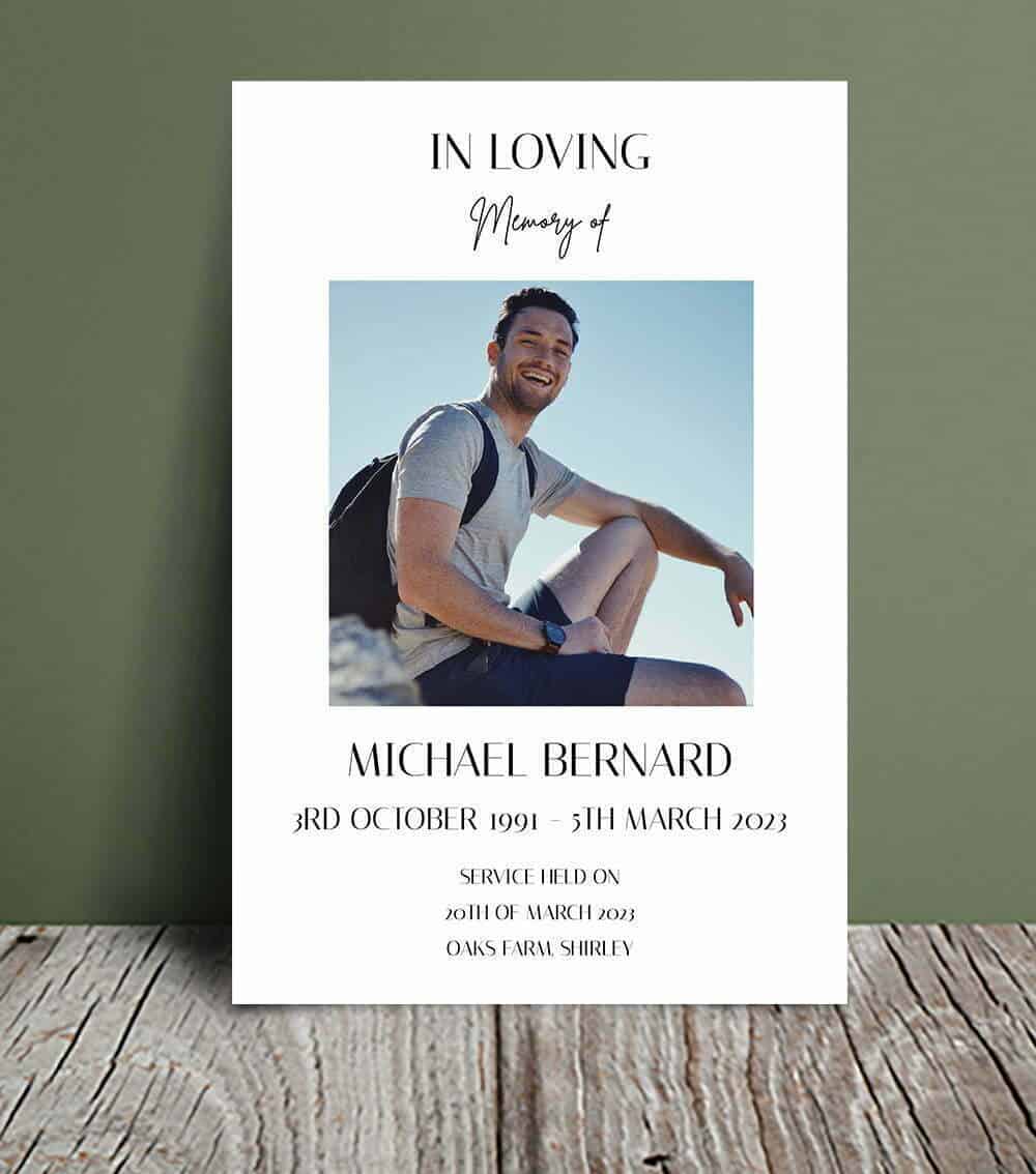
For modern funeral order of service printing, select fonts that are clear, legible, and sophisticated. Sans-serif fonts like Helvetica, Arial, or Lato are popular for their clean, minimalist look, offering a contemporary feel without sacrificing readability.
Serif fonts like Georgia or Garamond can also work for a modern yet timeless touch, adding subtle elegance. Use font sizes of 10–12 points for body text to ensure readability for all attendees, especially older guests, and larger sizes (14–18 points) for headings.
Limit Font Variety
To maintain a cohesive, modern aesthetic, stick to one or two font types in your funeral order of service printing.
Avoid overly decorative or script fonts, as they can be hard to read and feel dated. For example, combining Helvetica for headings with Open Sans for body text creates a sleek, professional look suitable for a modern program.
Personalize Thoughtfully
Ensure the font remains legible and aligns with the program’s overall tone to keep your funeral printing respectful and polished.
Selecting Colours for a Modern Funeral Order of Service
Embrace Muted, Sophisticated Tones
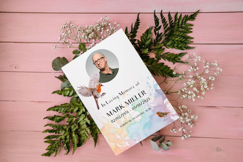
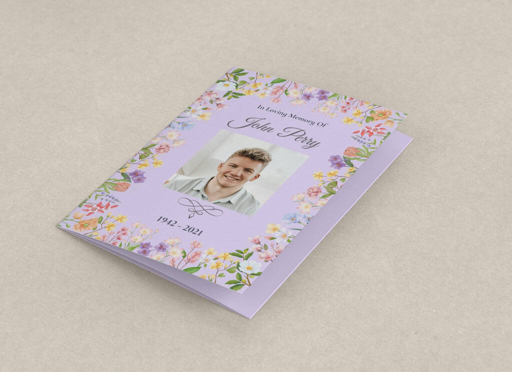
Modern funeral order of service printing favors understated colours that convey respect while adding a contemporary touch. Opt for muted tones like navy, charcoal, soft gray, or deep green for a sophisticated backdrop. Soft pastels, such as blush pink or pale blue, can add warmth while maintaining a modern aesthetic.
Incorporate Personal Accents
To personalize order of service printing, you can consider incorporating a subtle accent colour that reflects the deceased’s personality or preferences. For example, if they loved the ocean, a muted teal accent for borders or headings can be a meaningful touch.
Consider Paper and Finish
The paper and finish you choose for your funeral cards printing can enhance the colour scheme. Matte paper complements muted tones, offering a soft, glare-free look that feels modern and dignified. Glossy finishes can make colours pop, especially for photo-heavy designs, but may feel less formal.
Designing a Modern Layout for Funeral Order of Service Printing
Keep It Clean and Minimalistic
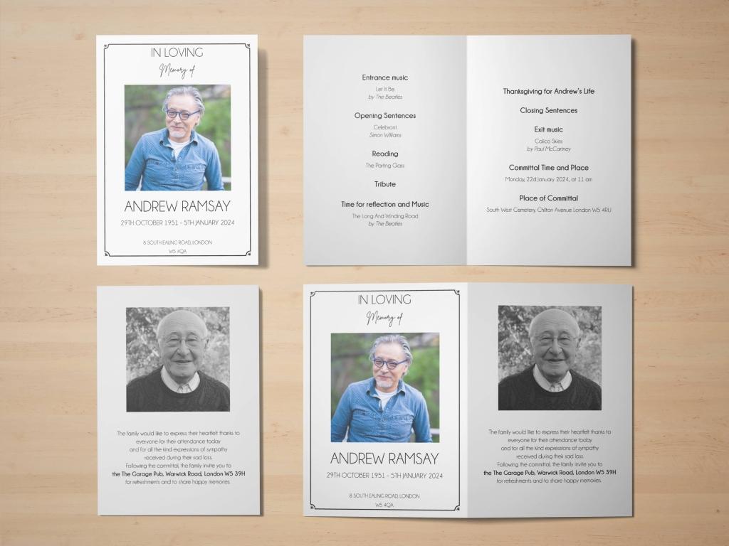
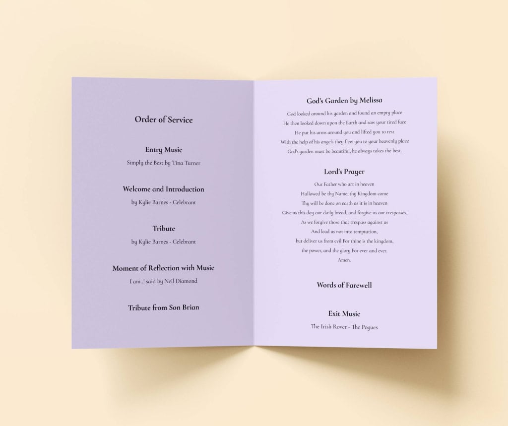
Use ample white space to avoid a cluttered appearance, making the program easy to navigate. Organize content with clear sections such as Welcome, Readings, Hymns, and Tributes using bold headings to guide readers.
Align text to the left or centre for a clean look, and avoid justified text, which can create uneven spacing. A single-column or two-column layout works well for booklets, ensuring a streamlined flow.
Incorporate Subtle Design Elements
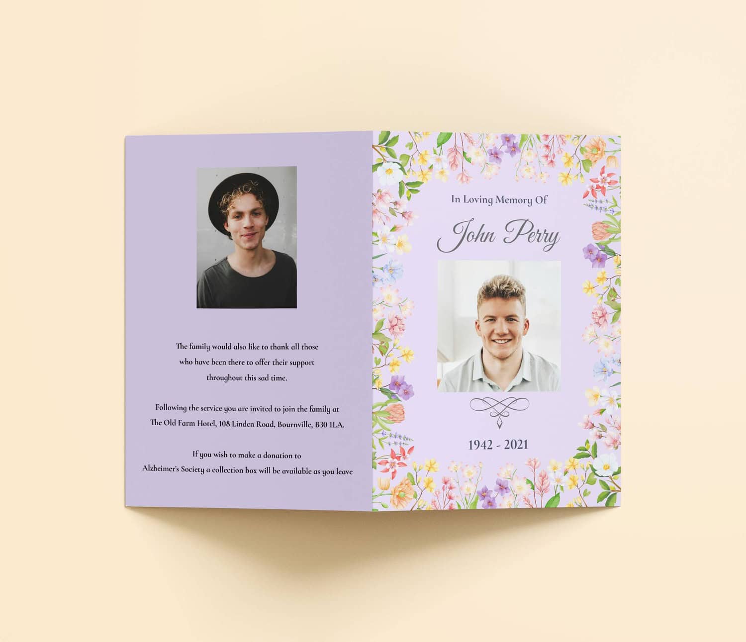
To add a modern flair, include subtle design elements like thin borders, delicate lines, or minimalist icons (e.g., a small cross or flower). These accents enhance the visual appeal without overpowering the content.
If including photos, place them carefully, such as a single cover image or a small collage on an inside page, to maintain focus on the text. Ensure images are high-resolution (at least 300 DPI) to avoid pix elation in your order of service for funeral prints.
Balance Text and Imagery
Balance text and imagery to create a visually appealing yet functional program. Limit photos to one or two meaningful images to avoid clutter, and ensure text sections are concise.
For example, a short tribute (100–150 words) paired with a single photo can create an emotional impact without overwhelming the layout.
Practical Tips for Flawless Funeral Order of Service Printing
- Work with a Professional Printer: Choose a printer experienced in funeral order of service printing to ensure your fonts, colours, and layout translate perfectly to print. Share your design preferences early and ask about their template options for a modern look.
- Request a Test Print: Before finalizing your order, request a proof to review how fonts, colours, and layout appear on paper.
- Proofread Thoroughly: Double-check all content and enlist a second pair of eyes to ensure accuracy in your funeral order of service
- Use Templates for Efficiency: Many printers offer modern, customizable templates that streamline the design process. These templates often feature clean layouts and pre-selected fonts, making it easier to achieve a contemporary look.
- Plan Ahead: Start designing as soon as ceremony details are confirmed, ideally a week in advance, to allow time for revisions.
Common Mistakes to Avoid
- Using Too Many Fonts: Mixing more than two fonts can make the program look chaotic. Stick to one or two complementary fonts for a cohesive, modern aesthetic.
- Overusing Bright Colours: Vibrant or clashing colours can feel out of place. Opt for muted tones and limit accent colours to maintain a respectful tone in order of service prints.
- Cluttering the Layout: Overcrowding with text, images, or decorative elements can reduce readability. Prioritize enough white space and simplicity for a clean, modern look.
- Ignoring Readability: Small font sizes or low-contrast colours (e.g., light gray text on white) can strain readers’ eyes. Ensure text is legible with high contrast and appropriate sizing.
- Skipping a Proof: Failing to review a digital or physical proof can lead to printing errors. Always check a proof to confirm the design meets your expectations.
Collaborating with a Printer for a Modern Design
Partnering with a printer skilled in funeral order of service printing is key to achieving a modern, professional result. Discuss your vision for fonts, colours, and layout early, and ask about paper options and finishes like matte for a subtle look or glossy for vibrant images.
Request a digital proof to review the design, and confirm turnaround times, especially if you need urgent printing. A reliable printer can guide you through template options or custom designs to ensure your funeral order of service printing feels contemporary yet respectful.
Conclusion
Designing a modern funeral order of service printing involves thoughtful choices in fonts, colours, and layout to create a program that’s both visually striking and deeply meaningful. By selecting clean, legible fonts like Helvetica or Georgia, using muted colours with subtle accents, and crafting a minimalistic layout with ample white space, you can achieve a contemporary yet respectful tribute.
Work closely with a professional printer, request test prints, and proofread carefully to ensure quality. With these tips, your funeral order of service printing will serve as a beautiful guide for the ceremony and a lasting keepsake that honours your loved one’s memory.
Ready to create a modern funeral order of service? As an expert in funeral order of service printing services, Order Of Service For Funeral Printing offers customizable templates, premium paper options, and professional design support. Let us help you craft a contemporary, heartfelt tribute for your loved one. Contact us today to get started!